DeFi’s UX Problem Is a Feature, Not a Bug
They say DeFi has a user experience problem. Clunky interfaces, confusing transactions, approvals on approvals—everything wrapped in walls of unexplained data and buttons that may or may not wreck you.
But here’s the truth: the confusion is the point.
DeFi doesn’t suffer from bad UX by accident. It thrives on it. Because the moment users actually understand what they’re signing, how their funds are routed, or what that weird contract interaction really does? Half the dApps would be empty overnight.
It’s not about onboarding anymore. It’s about obfuscation. Every extra step, every vague button, every transaction with a 0x function hash instead of a readable message is doing one thing: keeping users too disoriented to ask the right questions.
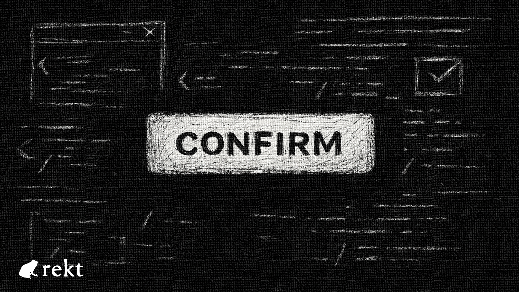
How many of us have hit “Confirm” just to make the damn thing go through? How many have connected wallets to front ends we didn’t trust just because everyone else was aping in? In DeFi, speed is the sell, and clarity is a liability. Because clarity kills FOMO. Clarity makes you think.
And that’s bad for business.
Some platforms try to change it. They build better flows, simulate transactions, warn you before you do something stupid. But those are the exception, not the rule. Because for most of the industry, confusion equals compliance. A user that doesn’t understand is a user that won’t question.
Want real UX in DeFi? Start by building with the assumption that users deserve to know exactly what they’re doing. Until then, don’t call it a user experience problem.
Call it what it is: design by deception.
REKT作为匿名作者的公共平台,我们对REKT上托管的观点或内容不承担任何责任。
捐赠 (ETH / ERC20): 0x3C5c2F4bCeC51a36494682f91Dbc6cA7c63B514C
声明:
REKT对我们网站上发布的或与我们的服务相关的任何内容不承担任何责任,无论是由我们网站的匿名作者,还是由 REKT发布或引起的。虽然我们为匿名作者的行为和发文设置规则,我们不控制也不对匿名作者在我们的网站或服务上发布、传输或分享的内容负责,也不对您在我们的网站或服务上可能遇到的任何冒犯性、不适当、淫秽、非法或其他令人反感的内容负责。REKT不对我们网站或服务的任何用户的线上或线下行为负责。